When life gives you lemons, Santos Collective will help you make lemonade.
How a Website Redesign helped give back to the Santos community.

During my last weeks at Ironhack, I was given the opportunity to pair up with Santos Collective as a stakeholder for my final project.
What is Santos Collective?
Santos Collective was established by local companies in Santos-o-Velho, Lisbon thinking about their community as a whole and to support local commerce. Following the success of the social initiative called Festa Estranha, on Feb 2019, local merchants came together for the well-being of the community. This collective created Santos Collective, a social and environmental cooperation.

Since June 2020, Santos Collective has been organizing community gatherings in the Largo da Santos-o-Velho Church that provides a safe community meeting, while supporting local businesses and merchants. They’ve sought to include and support different commercial sectors. For this reason, it has created different types of community events: Pop ups from local restaurants, launching small businesses, promoting small producers and local artisans.
What’s the problem?
My main point of contact throughout this process was Joana Bernardino. Our conversation about Santos Collective was exciting and enthusiastic and I could tell just by her tone that this is her passion and she needed help to bring this passion into light, visually. A new updated website, something that told a story of who they are as an organization, while bringing her community together and stronger, especially during these tough times.
“Something that represents who we are and what we aim for” — Joana
Research and Findings
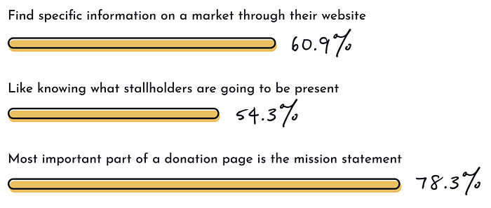
I knew an updated web design was our main goal for this task but to truly understand what users need and how the web sight should be organized, I sent out a survey on several social platforms. Around 50 people shared their ideas and experiences on the topic:

To dig deeper into these results, I conducted a series of interviews.
I spoke with a couple of locals from Santos-o-Velho and some regulars of Santos Collective markets, along with people who have never been to this event but have been to other markets. There were a lot of positive outputs, but what I noticed the most was the sense of familiarity and welcomeness it created for the community — whether it be Santos or a different location.
Most of my interviewees from Santos were people who had recently moved or had been there for years but weren’t native. And everyone said the same thing — we see Santos as our home away from home and we want to help continue this amazing organization.

Santos Collective has managed to bring businesses and locals together and create a home away from home. So…

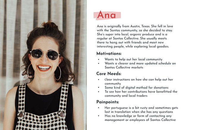
Meet Ana, our User Persona

As a User Persona, Ana reflects the people who took part in our research. She is originally from Austin, TX but fell in love with Lisbon during a study abroad trip and decided to move back with no return date in mind. She’s a regular and owes much to Santos Collective for opening their arms and welcoming her to the Santos community. Her Portuguese is a bit rusty so language barriers are very common. She wants to give back and contribute to this amazing cause but has no clue how and neither do any of her local friends.
How can we empathize?
By creating our empathy map, we were able to reflect key traits that
the user demonstrated during the research. The map provided
an overview of the personas experience.

Through this map, we understand who we are empathizing with, what they need to do and what they currently see, say, and do. We also know what they gain and what are some of their current pains — by breaking down this this information, we are able to decipher what is not so important and what to prioritize in the website redesign.
Take us through our User’s Journey
We are able to visualize the users process from finding Santos Collective to accomplishing our main goal — giving back to the community. With this, we can understand and address the users needs and pain points.

Our pain point is the user needs an accessible and fast way to find relevant information on Santos Collective. This can be accomplished by accessing their redesigned website, and having those options easily displayed.
Sitemap
Minimizing any confusion that a visitor might have when navigating the Santos Collective website or interacting with its content was the main goal.

After a dozen card sorting exercises with some volunteers, I decided on the following site map. As the user opens Santos Collective website, it’ll have 5 options displayed, these were the main pain points and needs from our users. As you’ll notice later on in the final prototype, the Give Back sub-tabs were reduced to just a post, given feedback from users.
Wireframes
This was a great opportunity to really break down the steps I wanted my user to use and decide what would be the most user friendly path.

Allowing to test at such a low fidelity, enabled criticism to be shared freely between users and designer. I gave them the overall goal, which was to make a donation, and asked them to comment on the visual process as they went along.
Comments, feedback, even the process a user took without any verbal feedback was taken into observation and altered as I saw best fit for the final design.
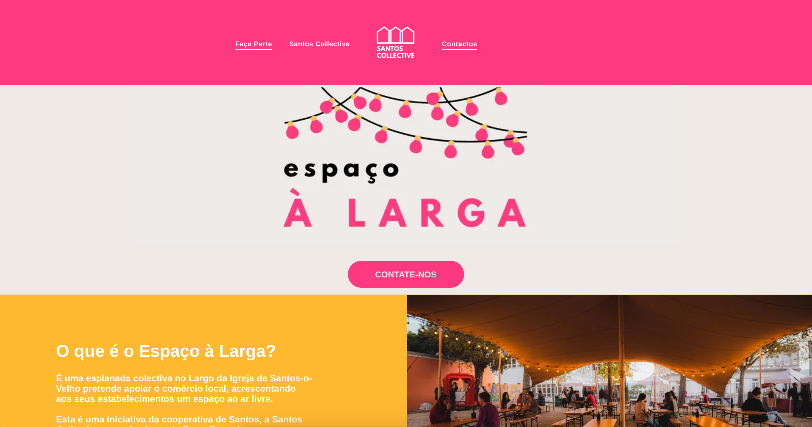
Existing Website


Website Redesign
Homepage
After selecting your language preference from the introduction page, you are automatically redirected to the homepage. Users are greeted with a feature market on a carousel, and our tab options on the upper right corner — along with the option to switch from English to Portuguese at any time. User can continue scrolling down and find brief intros to all the tabs.

Give Back
In this page, you can find a mission statement on how Santos Collective has helped the community and continues to do so — after testing, I decided to change the sub-tab to a simple post and really highlight how people can give back, while also informing them how Santos Collective does so without having to switch tabs.
It also gives the user 3 options on how they can help Santos Collective and the Santos-o-Velho community, along with an overall estimate of how much people have already contributed.

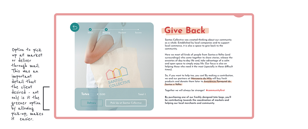
Give Back Checkout
Once the user has selected how they’d like to give back, they’re taken to the checkout page. For this option, we went with the tote bag. The user has a progress bar located on the upper part of the left hand image, so they’ll always know what step follows. We maintained the mission statement and gave more detail on the action and back story.

Final Prototype
Next Steps
For next steps, I would really like to develop the rest of the website. Seeing how a schedule is also necessary for users and the ability to get to know vendors and maybe pre-order options would help local commerce even more.
Overall, I’m very happy with the design, as was the stakeholder. It would be great to see these changes implemented into the current design and give users the chance to help give back to Santos, and give back to their community.
